BRANDING / BH
branding / featured
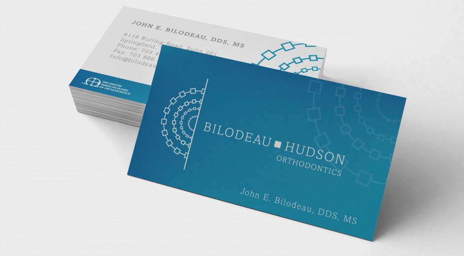
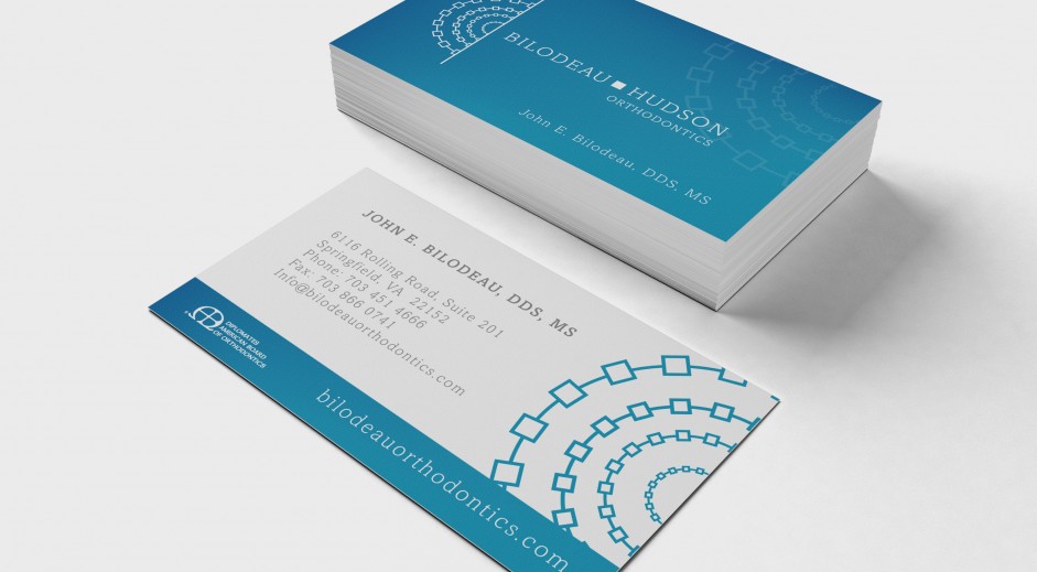
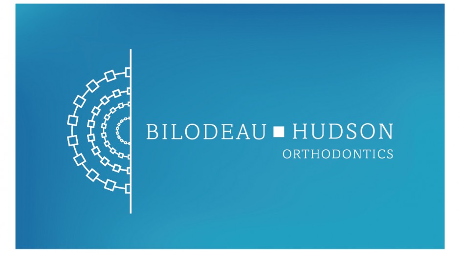
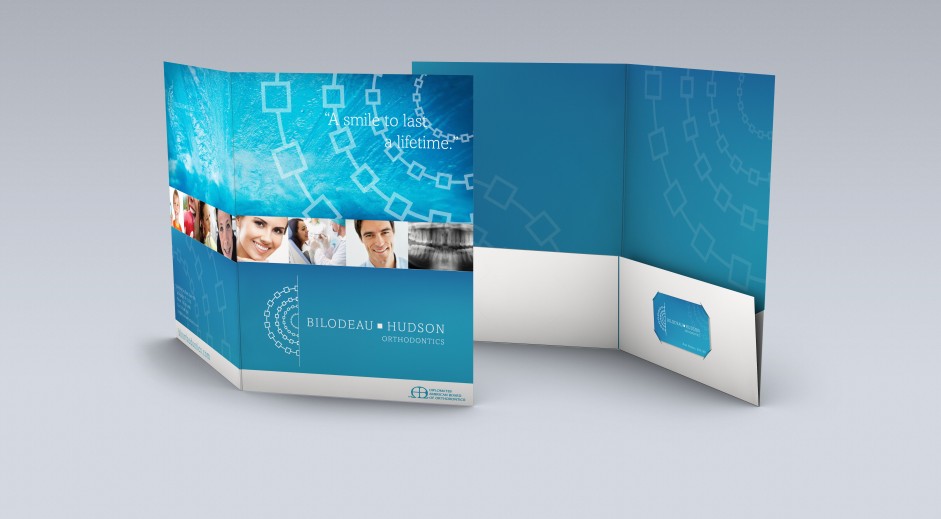
CHALLENGE
Bilodeau Hudson Orthodontics approached us in the fall of 2013 about redesigning their brand. Being a dental group, specializing in orthodontics, they did not want a cliche look with teeth, a smile or anything that resembled clipart.
SOLUTION
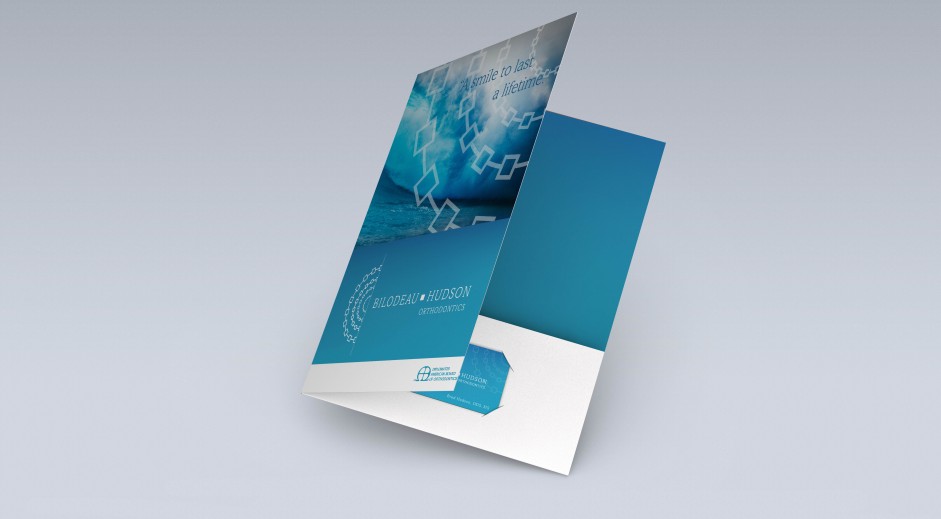
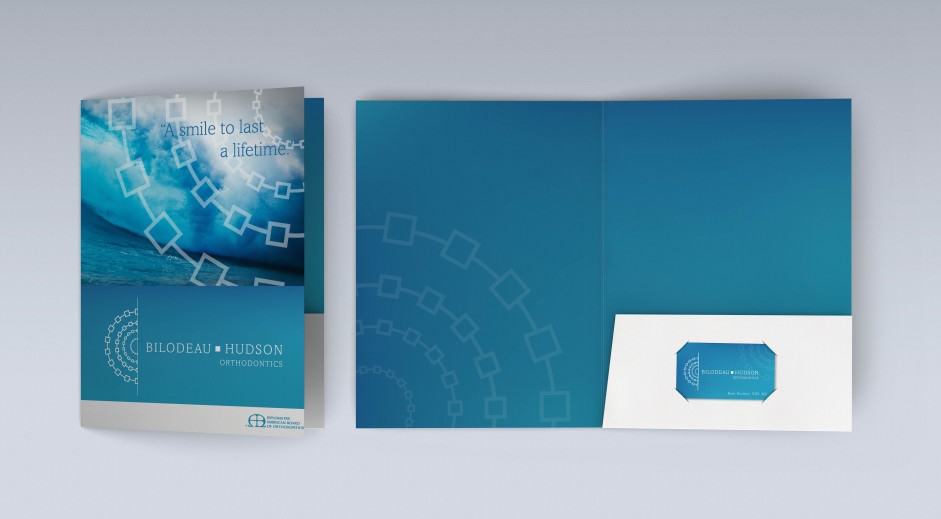
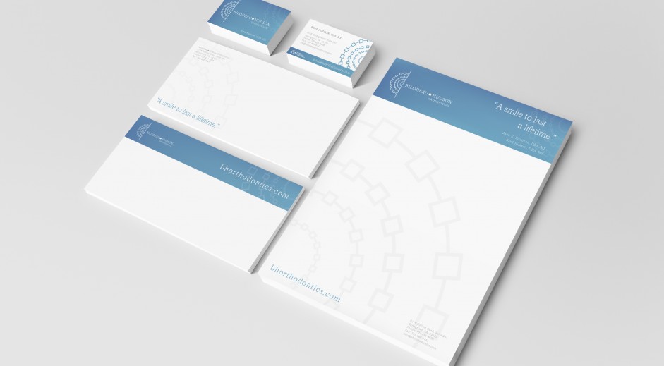
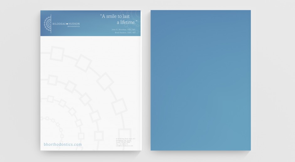
We asked Bilodeau whether we could experiment with abstract shapes that represented the work that they do. We also wanted to give the new brand a look that stands out by being elegant, sophisticated and clean.
RESULT
The result is an abstract logo that captures their speciality, orthodontics, using concentric squares made to represent braces.