


PRINT AD / MARINE CORPS HERITAGE FOUNDATION
advertising
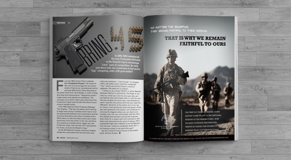
CHALLENGE
We were approached in late 2013 by representatives of the Marine Coprs Heritage Foundation to design three Ads/PSAs. For this project, the client wanted the concept of the ad to be fairly “simple”, in their words. They had bolded headlines that they wanted to emphasize, and more a paragraph of copy to be less emphasized. They also wanted any image to be a big part of what engaged the reader.
SOLUTION
After receiving the photography from the client, we immediately went to work in photoshop to not just recolor but also to shift the focus of each picture where we needed to highlight the headline.
RESULT
The result was a design that the client really loved. They were impressed with the way we treated the photos and the clean yet less-polished look to the font and design.